

THE PROBLEM
When city parks and recreational facilities began to reopen during the COVID-19 outbreak of 2020, the Los Angeles Department of Parks and Recreation directed all recreational facility reservations to be made strictly online to better manage social distancing and limit human contact through in-person payment. However, the desktop and mobile website had not been updated to meet the needs of a large influx of outdoor activity craving humans who had been locked up at home during California’s stay at home order. Before COVID-19, reservations were primarily made in person or by phone.
The website, especially its most used function, reserving recreational facilities, was in dire need of a redesign that would better serve the LA community.
Role: Solo UX/UI Designer
Timeline: Four Weeks
Tools: Pen, paper, Miro, Optimalsort, Maze, Adobe XD, Figma
CHALLENGE
A user-centered responsive redesign of the LA Parks and Recreation’s reservation website with an updated reservation experience that is easy to use, informative and efficient for a large demographic of users.
THE SOLUTION
A redesigned responsive website that is more user-centered, clear, efficient, informative and focuses on a more descriptive and flushed out reservation process that prioritizes user needs.
Desktop

Mobile


BACKGROUND
The Los Angeles Department of Parks and Recreation website offers a wide range of services and information. Users can learn about news and events, park projects and planning, park rangers, historical sites and activities .
Users can also look up park venues and facilities to reserve like campgrounds, basketball courts, swimming lanes and tennis courts to name a few. However, regardless of what kind of activity a user wants to do, they have to travel to a separate website in order to look up an activity and complete the action of reserving.
This separate LA Parks and Rec reservation website is where this redesign focuses on, with an emphasis on reformatting the reservation process for reserving tennis courts.
APPROACH
I’ll be approaching this project using the design thinking methodology to help guide me to a solution that focuses on the people I am designing for and create the best value for them.
And this is what the design thinking process felt like

How I came up with the solution


STEP 1:
EMPATHIZE
RESEARCH GOALS
First, it was important to think about research goals and create questions that would help me achieve those goals and detail the methodologies that I’d use to help me gather information.
Research goals are as follows:
Identify the target audience of the tennis reservation website
Learn how people currently approach using the reservation website
What are users primary motivations, goals and frustrations when using the current website
Learn more about current competition and what they’re doing successfully
METHODOLOGIES
Market Research
Competitor Analysis
Heuristic Evaluation and Markup
SME Interviews
1:1 User Interviews
LEARNING MORE ABOUT THE MARKET
Los Angeles is a large city with many different smaller cities within it. That being said, there are a lot of tennis courts to chose from. Each city has at least one tennis court complex that operates through that cities offices, i.e. Santa Monica City has their own courts and is separate from the bigger, LA parks and rec courts. Out of those courts, there are different way of reserving courts for a match. Some courts use a reservation process built into the cities website and some courts use apps to make reservations like Kourts.

It was important to understand LA parks and rec’s tennis court website’s direct competitors in order to get a good understanding of how other services have set up their sites for reserving courts.
Additionally, whether it be reserving a table at a restaurant, registering for an event or even making a doctors appointment, reserving things online has become a very common online practice and over the years, standards have been developed for that experience. Because of this, it was important to research indirect competitors in order to learn from their user experience, UI design and reservation flows.
COMPETITOR ANALYSIS
In order to better understand competitors both direct and indirect, I analyzed competitors to examine strengths and weaknesses of apps and services that allowed LA residents to play tennis.
Apps and services served different purposes from finding lessons, joining communities and reserving courts - it was important to examine indirect competitors that had strong reservation design patterns as signing up and reserving is now a common practice in todays virtual landscape

HEURISTIC MARKUP
How does a user experience the current product from beginning to end?
In order to understand the current user experience and how the site functions, I set a task for myself to complete using the existing site and documented my process throughout the experience.
Just from taking a brief at the interface, I knew I was going to have to sit down and really take some notes on interactions, design patterns and usability issues.

Throughout the process I was sure to log my thoughts as I moved through the product

HEURISTIC EVALUATION
After putting myself through the task flow, I ran the existing site through a heuristic evaluation in order to measure the usability of the current user interface.
CONTEXTUAL INQUIRY
To learn more about the problem space and peoples experience at LA city courts, I spent about 1 hour over the course of 3 days just observing the environment at 3 different tennis courts.
At first I walked around the courts looking at signs posted on the court fences, watching players interact with their environments and listening to conversations.
After a while, I posted up next to the attendant booth where players were supposed to check in and listened to the conversations players would have with the court attendants.

COVID rules were a common sign I saw multiple times at each court that I visited as well as some other rules that I hadn’t noticed online

Paper signs were posted everywhere detailing how to reserve a court online and that they no longer accept in-person reservations

Another court that had similar steps posted for reserving a court that were slightly different than instructions I had seen at the previous court
OBSERVATIONS
Doing a contextual inquiry was super helpful. I couldn’t believe I learned so much just from hanging out around the area and observing the environment
For the sake of space, I’ve decided to only name a couple observations here, but happy to talk about the rest of them if you’d like!
Some people would come to play tennis only to be told that they’ve come at the wrong time and sometimes on the wrong day.
Instructions for reserving online were also different between courts.
When people checked in with the attendants and had to show there reservation for confirmation they told the attendant that they had reserved using their computer and didn’t know how to access their reservation through their phone to show them.
Some people didn’t know they had to sign up online and wanted to try and reserve a court through their phone but they ended up not being able to figure it out.
SME INTERVIEWS
I wanted to get a better understanding about the problem space so I interviewed the tennis attendants that were responsible for checking in and managing reservations.

Cheviot Hills Tennis Courts
Findings from across all courts visited:
People call the attendants everyday because they can’t figure out the website and they have to walk them through each step.
Players ages are from young adults to middle age with some outliers being older players at around 65 - 75.
People say the terminology is misleading and causes a lot of confusion.
People often get stuck when they’re trying to find a court that’s close to them.
People often mix up their reservation and show up on the wrong day.
Attendants said that some of the hardest parts of reserving a court online was choosing a location because users have to scroll through a long list of facilities that don’t necessarily even lead you to one that has a tennis court.
Lastly, navigating through the terminology because, “it’s very robotic and doesn’t help them know where to go”
TALKING WITH USERS
After I had observed my surroundings at each court and interviewed the attendants, I reached out to 5 participants who play tennis on a regular basis.
Recruiting participants for an interview was harder than anticipated. People were always moving around. They were either quickly on their way to the attendant booth to make their reservation on time, playing tennis or walking back to their cars.
That being said, I had some incentive. I came prepared with Starbucks gift cards as a reward for those willing to be interviewed.

side note - I really enjoyed these illustrations.
By asking them open ended questions and listening to their responses, it helped me gain a strong understanding of why they play tennis as well as their needs, wants, motivations and frustrations when it comes to playing tennis at these courts.
I also had some assumptions about my users validated! Some of those assumptions were:
Users play tennis because they enjoy being active and being outdoors
Users struggle with reserving a court and seeing what courts are available.
People are looking for a more simplified website that allows them to reach their goals quicker
User’s will book a tennis court from their desktops computers at home or at work because using their phones is “a trash experience”
Users would prefer to experience an easier booking process from their phones
Users prefer to play at a court close to where they live
STEP 2:
DEFINE
MAKING SENSE OF INFORMATION
I recorded participants responses on sticky notes and then used an affinity map to help group similar insights and themes into categories in order to help me define the main problem I need to solve.

DEEPER UNDERSTANDING
From the affinity map I created an empathy map so that I could better understand and communicate the problems and mindset of our users in an easily digestible manner by looking at various attributes of the persona based on what they are thinking, feeling, seeing and doing.

USER PERSONA
By looking at similarities in data from my research, I was able to develop a user persona which represents the “archetype” user. This persona will be used throughout the entire design process to ensure that I’m designing for the users.

PROBLEM STATEMENT
After the research had been synthesized and I had an understanding of my user’s needs and goals, I needed to continue to define the problem that I would be solving through design.
After generating a couple of POV statements, I choose the one I thought would provide the most value to users based on what I’d learned through research.
THE PROBLEM
{user persona} needs {insert need} because {insert insight}
{Tomas} needs to {quickly reserve a tennis court near him} because {he wants to workout after he gets home from work with his friends who live in the area}
HOW MIGHT WE?
After the problem statement was defined, I developed 4 HMW statements that would help me explore different perspectives of solving the problem
How might we make the current reservation process more effective?
How might we help Tomas find a court near him?
How might we decrease the amount of steps in the reservation process?
How might we create an easier way to search for courts?
STEP 3:
IDEATE
CRAZY 8S
Let’s come up with some possible ways to solve this problem!
Crazy 8’s allowed me to quickly get ideas out on paper and generate potential solutions
I wrote each HMW statement on a sticky note and put it on a piece of paper that I had folded into 8 sections, set a timer for 8 minutes and went to work sketching 8 ideas in 8 minutes.
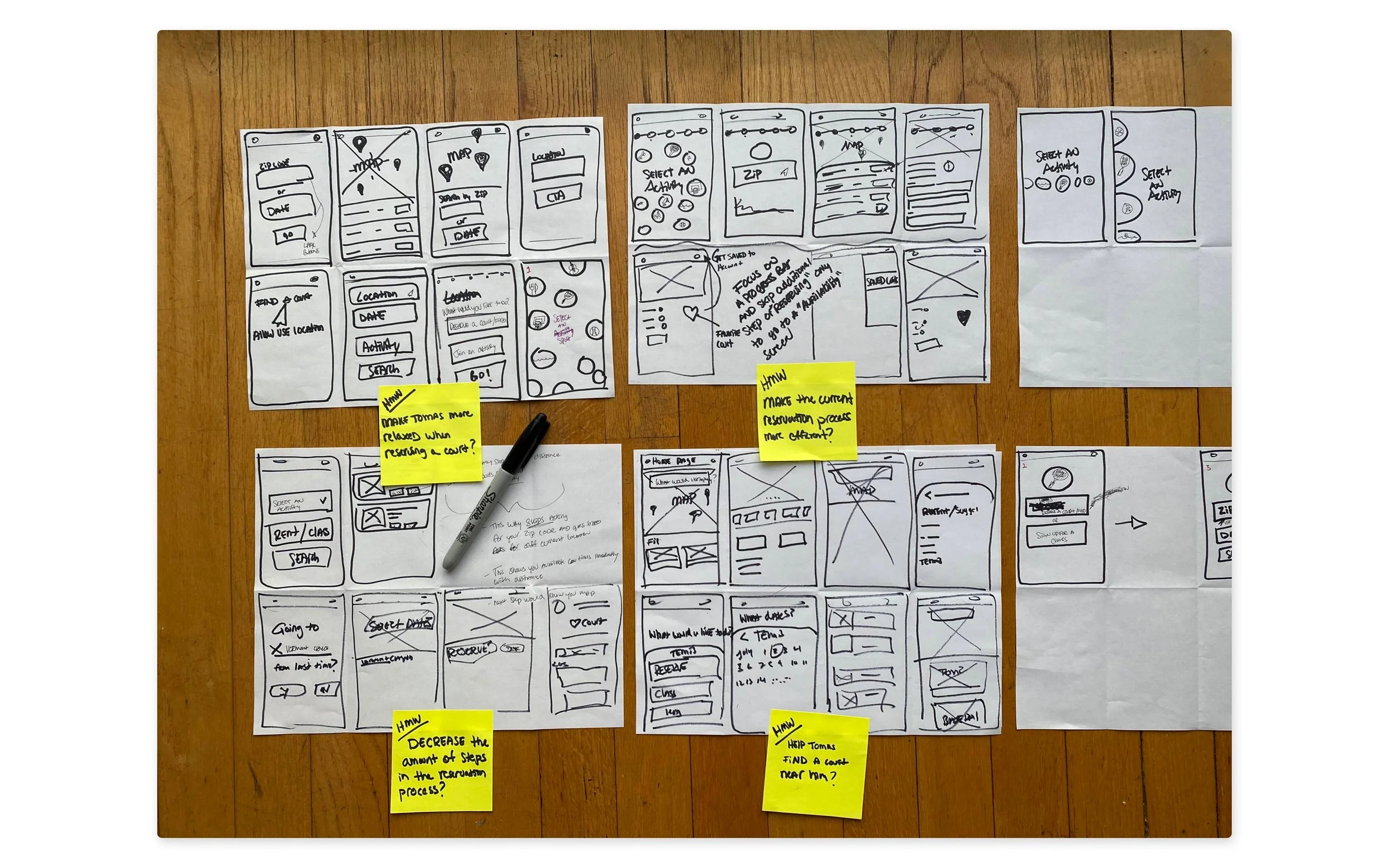
How did I decide on which idea(s) to explore further as a potential solution?
With all my prior research and persona in mind, I took a step back and looked at what I had just created. Looking at the sketches, I realized that there was really one statement that embodied all the others: HMW make the current reservation process more efficient?
Additionally, each crazy 8’s session had generated different elements that, based on my previous research - would help solve the problem and would be applicable to making the current reservation process more efficient.
USERS IN CONTEXT
To better understand and empathize with users in a quick way, I created a storyboard in order to show context and the environment my persona operates in as well as to show how my potential solution could help solve the problem.

How did I decide on which idea(s) to explore further as a potential solution?
With all my prior research and persona in mind, I took a step back and looked at what I had just created. Looking at the sketches, I realized that there was really one statement that embodied all the others: HMW make the current reservation process more efficient?
Additionally, each crazy 8’s session had generated different elements that, based on my previous research - would help solve the problem and would be applicable to making the current reservation process more efficient.
TASK FLOW
Ok, so how do I define what features I need to make for my prototype? The first step was to create a task flow to help define the features I would need to build out for the site overall and for the process of finding and reserving a tennis court.
With the “winning” HMW statement in mind, I only made one task flow:

CREATING THE SITE ARCHITECTURE
I created a sitemap in order to define the reservation website’s information architecture.
My approach to this was going through the current website and trying to map out the existing content.
Based on this I created my own site map where some irrelevant content from the original website was left out and more relevant information was added.
Originally, I didn't plan on performing a card sort activity because of the small amount of content - but, ultimately I decided on doing a closed card sort to validate my mental model with other peoples models. I used Optimalsort and was able to recruit 10 participants

In the end, my mental model of where information should be located was validated with nothing lower than 80% of participants agreeing
Step 4:
PROTOTYPE
PAPER WIREFRAMES
To start, I wanted to further develop some of the ideas I had come up with during the crazy 8’s exercise and apply my task flow with them in mind. I wanted this done quickly so I used pen and paper to sketch out some concepts

Choosing Between Two Designs
Throughout this process I was constantly looking back on my previous deliverables and at the HMW statement that I had chosen to help solve my problem statement.
HMW make the current reservation process more efficient? While wireframing I thought, “What would an “efficient” design look like in this context? Define efficiency“.
Two designs were created for the flow of reserving a court with this in mind, but I couldn’t decide which design to commit to. Which design provides a more “efficient” experience for the user? Which one more accurately solves the problem users are facing? Which one provides more value to them? Which design helps them accomplish their task more efficiently?
Design 1

Design 1 - With activity selected


Design 1: Focusses on a step-by-step approach, informing users of the choices they have relative to the activity they chose. This design focusses more on simplicity, clarity and using large icons to represent different activities as well as a progress bar to show users were they are in the system.
Design 2

Design 2 - Activated


Design 2: Uses a filtering bar in order to help a user quickly set the metrics of their search. This design focusses more on speed.
PROTOTYPE
Before moving forward, I developed the rest of the website in the form of mid-fidelity wireframes so that I can go fourth with a full usability test along with an a/b test to see which design was more accurately solving the problem and to test how well the over all decisions I was making were translating to users.
Testing at this point would allow me to choose one design for the reservation process and help me identify any points of friction so that I could iterate

This was taken after I had given the screens a visual upgrade
STEP 5:
TEST
USABILITY TESTING
The usability tests were remote moderated “think aloud” tests via Zoom alongside Maze’s rapid prototyping platform.

Measurable Successes
Going into usability testing, there were a couple specific design elements that I was hoping would prove useful to participants and help add delight to their experience with the redesigned reservation website.

One of those elements was the progress bar, something the original design was severely lacking. Making a reservation for any recreational activities with the original design was a lengthy process already and it didn’t help that users had no idea where they were in the process and how close to the end they were in the reservation process. In testing, I’d be asking users to tell me where they think they are in the reservation process and what step would be coming next.
While designing, I had originally considered putting other information in the place of the “available time slots” content, like putting available courts instead However, research indicated that users cared more about the times that courts were available rather than which specific court was open.
I decided to test to see if my reasons for putting them there were validated. Those reasons were to save users from clicking on a location card and going to the court page only to discover that there were no times available. I was wondering if this feature would be used or if users would just click or tap on the card and either not see the available time slots or not know that they were buttons.

In addition to testing specific elements in my design, I was also testing to see if users were able to quickly understand what this site offers and what the main function is.

When I interviewed tennis court attendants, they mentioned that users had a hard time understanding what to do once they reached the website because of its current layout. During my own heuristic markup of the website, I was able to confirm that it yes, it’s very confusing and has very limited information.

For this redesign, it was of course important to make sure users had a clear understanding of what the site was for, but I also wanted to include elements that would help easily inform users of other activities and events that they could do through the site. I was excited to see if my decisions were effective in testing.
Some of those decisions were to included an “explore nearby” section and to incorporate icons instead of just words to show “activity types” so that users could quickly recognize that there were other activities they could participate in.


Here are the icons used for choosing an activity. If fully designed, each icon would have its own path. The flow that was researched and then built out for this project, was tennis. Users click the tennis icon and then they are prompted to chose between 3 separate options: reserve a court, find lessons, join a league. These options would be different if a user clicked on “camping” or “parks” instead.

FINDINGS
I discovered a lot of good information about my design that I was proud of and a lot of decisions I made based off the research were validated in testing. There were also some things I learned! Here are a couple examples of what I found:
80% of users knew where they were within the reservation and checkout process
100% of participants were able to find the tennis court closest to their location, reserve a court and add it to their calendars quickly and with ease.
100% of participants - even after instruction that the page they were starting on - did not contain information that would help them complete their task - still scrolled down the page looking for additional information that would help them complete their task.
100% of users clicked the “available time slot” pills that were attached to the court location card instead of selecting the entire court.
A/B Test - Design 1 or 2? Which did users prefer and why?
100% of participants preferred design 1 over design 2
60% of participants said, while design 2 was faster, it was more confusing, less intuitive and less informative than design 1.
100% of users said they enjoyed the step by step approach of design 1 because it made them feel, “at ease”, “made more sense as to what they’re supposed to do” and “didn’t have to think too hard about it”
Users mentioned that because there are icons associated with other activities in design 1, it told them that there are other things they can do on the site and gives them more interest in coming back and finding out about other activities near them.
These insights were enough for me to use design 1 for the reservation flow. While I personally enjoyed design 1 more, I really thought design 2 was going to perform better in testing - to my surprise, design 1 did far better than anticipated.
STEP 6:
ITERATE
AFFINITY MAP
While I was happy to see a lot of my design decisions validated in testing, there were some other issues that appeared during usability testing.
During the interviews, I recorded all of my notes on a word document, writing down what participants pressed, what worked and what didn’t, points of friction and successes.
After this, I transferred the answers to sticky notes and color coded them for each participant, also putting a number on each answer related to the corresponding task that the note came from.
Then, I recategorized them by grouping all their answers together by successes and pain points.
After those categories were created I recategorized them detailing specific features that were or were not working along with take aways and solutions to these problems.

Priority Revisions
I prioritized these findings based on the level of impact and effort. There were a lot of little UI issues that I hadn’t expected to be a problem but were easy enough to fix. There were also somethings that I hadn’t considered that a number of users had brought up. During testing one task had users starting on the “courts near you” page, where I asked them, “from this page, how would you find information about tennis tournaments happening this season?”.
All 5 participants scrolled down to the bottom of the page to look for more content. For the most part, their facial expressions came off as confused and after they couldn’t find what they were looking for, stressed.
After scrolling, users went to the top navigation and clicked “events” which completed the task.
Even though participants were able to complete the task the way I hoped they would (given a little bit of a struggle), the extra time it took for them to use the top nav and the fact that all of them scrolled down looking to find answers was enough of an insight for me to add a new block of content titled “Related Activities” that would change respective of the type of content that the user is viewing.

This part was added to increase flexibility of navigating around the site and to allow users to find related content.
Pay Pal and Apple Pay were added after 3/5 users mentioned that they were “use to” having the option to use other forms of payment instead of only having the option to put in their credit or debit card.
2/5 users also stated that not having alternative payment options decreased their perception of the trustworthiness of the site and they would normally bounce.
Taking these notes into consideration and then taking a look back at my original user interviews and additional research, I decided that adding additional payment methods would also help my persona and support one of my original HMW statements and further, my design goal - to create the most efficient and convenient reservation experience for users.

UI KIT
LA’s Department of Parks and Recreation had existing branding, but weren’t using it to their fullest potential.
In some instances the branding was unnecessary and distracting and definitely not accessible. I wanted to create a system that was more inclusive, simplified and more informative while still maintaining brand elements.
A UI kit was developed throughout the design process in order to establish a language for the design system and to act as a document that could be passed over to the development team in order to ensure design elements remain consistent throughout the site and through any future developments or iterations.
Here are some examples:


IMPROVEMENTS TO THE MOBILE DESIGN
With the original flow, users we’re given a huge list of locations to choose from, some of which didn’t even have tennis courts. If you are a new user or new to the area, how are you supposed to know where these places are relative to your location? The design was unintuitive and difficult to navigate. Most of the important information was hidden beneath the fold so users would’ve had to scroll in order to even see if their search inputs had been processed. If users didn’t scroll it was hard to tell that the system had processed the user’s original search inputs.

Original Design
From research, I found that users were trying to find courts near them and wanted to reserve them quickly. It was important to create an experience that was quick, intuitive and easy for the user to accomplish this. A more informed homepage was created based on information that was scattered throughout the original design to allow users to discover information. For finding an activity and reservation process, a simple step-by-step approach was used accompanied by a progress bar to help the user understand where they are in the process.

Redesign

Here are some examples of the screens I started with and where I ended up at the end of the process.

The original landing page

Original screen for selecting an activity, choosing location, date & time.

Individual court page

Redesign

Redesigned version with icons to represent different activities.

New court page showing available times and courts depending on date
Final Prototype
Desktop
Mobile
CONCLUSION
I was really happy with the way this turned out because a lot of my assumptions were validated through testing and I attribute that to having gathered so much information in the empathize stage. I really enjoyed gathering all that information and checking my design with users along the way instead of only at the end. When it came time to test which design performed more efficiently with users, it was really exciting to see why and what exactly “efficiently” meant to users.
Next Steps and Measuring Success
Next steps would be to go through another round of testing to see how my revisions performed and then ideally test it with more people. I’d love to get an opportunity to test it in the environment users would actually be operating in and to see how successful the redesign was.
When thinking about how to define a successful redesign, I thought back to my interviews with the different tennis court attendants and how they told me how they receive a heap of phone calls daily from players asking them to walk them through the process of signing up for an account and reserving a court, or even rebooking - especially during the first couple months after they changed reserving courts by phone calls and in person to fully online. I would measure the redesigns success by seeing a decrease in phone calls to the court attendants, a decrease in the time spent in the court reservation process, decrease in bounce rate and a decreased in the amount of players who show up on the wrong day of their reservation.
I’d also consider an increase of reservations via mobile devices a success. During user interviews, users often wanted to reserve a court with their phone but found that the process was too complicated and “annoying” so they waited until they were in front of their desktop.
Thank you for reading ✌️