

PROBLEM
People are wasting food at home.
Food waste has and continues to be a global problem for many reasons. It wastes our resources, energy, takes up space in landfills and generates greenhouse gases and of course is wasted when it could’ve been used to feed someone else.
It’s no surprise that the pandemic has also impacted the amount of food the world and especially the United States is wasting. There are plenty of apps out there now that offer amazing recipes and ways for you to order all the ingredients you need online and have it delivered - but what’s out there that helps people use their food more efficiently? Food is wasted the most at the household. What’s behind this statistic? Is there an app that will help people remember about the food they already have? Everyone has had some experience wasting household food before. Whether thats a bag. of spinach that was left in the fridge or something that was hidden in the cabinet.
Role: Solo UX/UI Designer
Timeline: 2 weeks
Tools: Pen, Paper, Miro, Maze, Figma
CHALLENGE
I had 80 hours to design an MVP that would create an effective and impactful solution for reducing food waste at the household level.
SOLUTION
An app that is simplistic, breathable and helpful that seeks to combat food waste at the household level by scanning a user’s grocery receipts, organizing their groceries into proper storage areas, marking products with a use by timer, notifications with recipe suggestions based on food at home and “smart recipes” that uses a user’s groceries to create recipes.


How I reached my solution


STEP 1
EMPATHIZE
GOALS FOR RESEARCH
As always, before diving into research, I want to outline my goals for doing research in the first place as well as the methodological tools I plan to use to help me reach them.
Identify design standards used by competitors
Learn users’ thought processes and behaviors when deciding what groceries to get
Learn more about how food is wasted, where it’s wasted and learn more about what kinds of food are wasted in the household
Understand current behavior with wasting food, solutions, barriers, challenges and how they generally approach the problem
METHODOLOGIES
To help me achieve my research goals I’ll be using the following methodologies:
Secondary Research
to learn more about current problems with food waste from households and how people/companies have attempted to solve the problem
Competitive Analysis
to learn more about how competitors both direct and indirect approach the problem or similar problems as well as to analyze their design systems and identify any industry strategies and gaps for improvement
Survey
to gain quantitative data on how much food people typically waste, grocery planning and trends in recipes, knowledge of how to make food last longer as well as what food is typically wasted and why
1:1 User Interviews
to gain qualitative insights about users and their experience with food waste at home
SECONDARY RESEARCH
The first step into research was do some digging on food waste in America. Though during my searching, it seemed like most countries were pretty much on the same level in terms of food waste.
Food Waste Harms the Environment
Unsafe levels of methane gas is emitted from food waste while in our landfills which pollutes our atmosphere.
Too much methane produced on landfills causes more methane to inhabit the atmosphere which can cause the planet’s temperatures to rise to abnormal levels
According to the World Wildlife Federation, the production of wasted food in the United States is equivalent to the greenhouse emissions of 37 million cars.
Growing and throwing away food has a massive water, energy, climate footprint
Food Waste Puts a Strain on Our Resources


Examining where food waste occurs
Food loss occurs for many reasons, with some types of loss—such as spoilage—occurring at every stage of the production and supply chain. Between the farm gate and retail stages, food loss can arise from problems during drying, milling, transporting, or processing that expose food to damage by insects, rodents, birds, molds, and bacteria. At the retail level, equipment malfunction (such as faulty cold storage), over-ordering, and culling of blemished produce can result in food loss. Consumers also contribute to food loss when they buy or cook more than they need and choose to throw out the extras (See Buzby et al (2014).

According to the USDA, factors such as labor cost and labor availability, lack of refrigeration, aesthetic standards and consumer preferences, various policies related to the harvest and price volatility can cause food to be wasted at farms

Food loss occur during manufacturing from problems during drying, milling, transporting, or processing that expose food to damage by insects, rodents, birds, molds, and bacteria.

Equipment malfunction (such as faulty cold storage), over-ordering, and blemished produce can result in food loss. Food that appears to be bruised is not desirable and not purchased by consumers

Consumers becoming confused over “use by” and “best by” dates and food is discarded while still safe to eat, lack of knowledge about preparation, appropriate portion sizes and forgetfulness
Food Waste in 2020/ 2021
Food waste has always been an ongoing issue but with the pandemic, things changed quickly. With employees working from home, students learning remotely, and people ordering takeout to support their local restaurants, food bills skyrocketed as families spent more time - and ate more meals - at home. In the United States, the surge in food spending often translates to more food waste. Even pre-pandemic, we wasted massive quantities of food every single day of the year.
Food Spoilage is one of the biggest reasons people throw out food.
More than 80% of Americans discard perfectly good, consumable food simply because they misunderstand expiration labels. Labels like “sell by”, “use by”, “expires on”, “best before” or “best by” are confusing to people — and in an effort to not risk the potential of a food borne illness, they’ll toss it in the garbage.is one of the biggest reasons people throw out food.


LEARNING FROM COMPETITORS
Honestly, what I learned from doing a bit of research on food waste really surprised me. Moving forward, I wanted to research the market space to see what companies were doing about it. I analyzed competitors in order to get both a better understanding of the food app space as well as the design patterns that are common within these apps.
It was important to look at not only direct competitors but secondary and indirect competitors as well.

SPEAKING WITH USERS
After secondary and competitor research, it was time to talk to users. I learned from my previous research that food was wasted most at the consumer level (at the household) and that Food Spoilage is one of the biggest reasons people throw out food.
But why was this? How and why was food being spoiled? What was causing this? What are people currently doing to solve this problem? What kind of food was being wasted?
I needed to speak with users directly to learn more about them and preferably these conversations were to happen in their homes so that I could physically see their kitchens and refrigerators and at least momentarily live in their environment. This would allow me to more deeply understand them and it also allowed me to ask questions about how they organize their food and what the process was like for unloading groceries from the store. It also allowed me to observe their body language and facial expressions while they answered my questions throughout the interview.
While I asked questions focused around getting to know the users on a more personal level, I also wanted to focus on their grocery shopping habits, the amount of food they buy vs. the amount of food wasted, why it was wasted, what kind of foods were wasted, how often they replenish their food supply, what makes them throw food away in the first place and what are they currently doing to help solve the problem.
STEP 2
DEFINE
WHAT USERS WERE SAYING
I had gathered a lot of useful information from users interviews and now it was time to make sense of it. I used an affinity map to help me recognize patterns and start to make sense of the information.

FINDINGS
Participants had a lot more in common than I assumed. Most of them had similar grocery tendencies, all of them admitted to wasting food at some point on a weekly basis.
The reason why? For various reasons, they were all forgetting they had food that they could use at home.

SURVEYS
Originally, I wasn’t going to report my survey results since there were only two of them, but after looking at them again, their answers reinforced what I was finding out from user interviews.

DEEPER UNDERSTANDING
I used information from the affinity map to create new groups that would help me better understand and communicate the problems and mindsets of users in an easily digestible manner by looking at what they are thinking, feeling, seeing and doing.

Persona
I took a step back and looked at all my data so far.
From all my findings, I created Ethan to help focus the rest of the design process. Ethan would be representing the user base and helping ground my solutions as I moved on.

WHAT IS THE PROBLEM?
After research had been synthesized and I had a better understanding of my user’s needs and goals, I needed to focus on a problem that this app was going to try and solve.
Naturally, multiple problem statements were generated based off what I learned through research but I decided on the one that would provide the most value and have the most impact to users.
{Ethan} needs to {be reminded to use the food he has at home} because {he regularly forgets to consume it before it goes bad}
HOW MIGHT WE SOLVE THE PROBLEM
After the problem had been defined, I developed multiple statements describing “how might we” solve the problem in order to explore different perspectives in the pursuit of a solution that would most positively impact users.
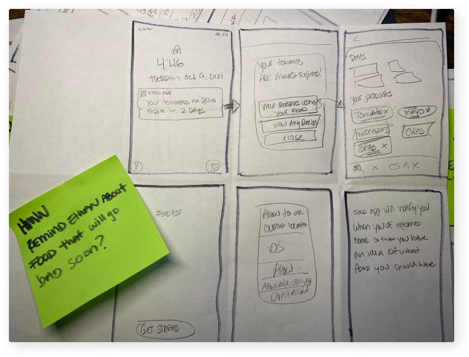
HMW help remind Ethan about food that will go bad soon?
HMW display items to prioritize perishable food?
HMW help Ethan use the food he has at home?
HMW help suggest how much food Ethan should buy based on his wasting habits?
STEP 3
IDEATE
RAPID IDEATION
Rapid Ideation
I used the crazy 8s exercise to help me quickly generated ideas. I wrote each HMW Statement on a sticky note and placed it on a folded piece of paper and stared ideating based off that one HMW statement.


USERS IN CONTEXT
To better understand and empathize with users in a quick way, I created a storyboard in order to show context and the environment my persona operates in as well as to show how my potential solution could help solve the problem.


FOCUSING ON TASKS
At this point, there were many possible ways the app could have built out.
As tempting as it was to start building every possible screen, I needed to keep the focus on only building out the MVP.
To stay locked in, I created two task flows in order to show the screens the user would have to move through to test the MVP.

FEATURE ROADMAP
A product feature roadmap was particularly useful at this stage as it kept me aligned with what I had to build as I moved into the designing in Figma.
Additionally, it helped me separate all the features that I wanted to build from the features that should be built to support the MVP
It was a hard choice - features that were moved into the “nice-to-have” section could’ve been built out - and - they would have supported the problem statement.
But due to time constraints, it was determined that those features could be built out and tested at a later time.

Features like “food waste analysis and suggestions” is based on a user’s habits. This would only work if the user had scanned multiple receipts over a couple weeks and also logged food losses in the app regularly.
The idea behind the feature was that it could learn the optimal product quantity to buy in order to avoid wasted food. This would be based on how much of something a user had bought and how much of that something a user had wasted over a period of time.
STEP 4
PROTOTYPE
SKETCHING
Paper wireframes were super helpful with getting started this time around. Even though I was designing a fairly task based flow for the app, I still needed to make sure things made sense and that elements showed up at the right times.
Because time was valuable to me at this point of the project, I spent more times on paper wireframes to make sure I had the visual design of the flow down before I started designing in Figma.


Here I was trying to figure out a way to represent time with color and how gestures would be used in the design.
Here are some of those sketches in digitized format:


VISUAL APPEARANCE
My goal here was to create a soothing, breathable visual appearance. I did’t want the tones to be too Earthy. I wanted the design to be whimsical and efficiently clean while also guiding the user through the interface.


UI ELEMENTS
This app allows users to upload information from their real-world purchases and the app takes that information and displays it in a useful way to help reduce food waste by reminding users of the food they have as well as curating recipes based on the products that they’ve entered into the app. Because this includes an upload process, it was important to include a progress bar to allow users to see where they are and what they’re currently doing in the system.

When users scan a receipt, the app will categorize products into their correct storage areas. During secondary research and user interviews, improper food storage methods was a main contributor to food waste in the household.

Once users had completed the entire upload process, they arrive at the home screen. This screen allowed them to see all of the products they uploaded along with the product’s general “good by” date which was color-coded to show different levels of “time remaining” until the product could possibly go bad and storage location.


These product cards are also actionable and could expand when tapped to help users find a recipe using one of their products.

Gestures could also be used on these product cards to swipe right to add a used product to their grocery list or swipe left to tell the system that they had wasted that product. Having the ability to view “wasted” products separately could help users see exactly what food they were wasting and how frequently they were doing so.

PROTOTYPE
After building out the structure of the app, I created a clickable prototype in Figma based on my task flows from earlier. I also included a separate flow in order to test to see if using gestures to add or delete items off a user’s product list was intuitive for participants.

What am I testing?
While I would be watching how participants moved through the tasks, noting anything of value that they said or did, and paying special attention to any usability issues, there were some specific things I was looking out for while users went about the process.

Moving items from the “My Foods” section is an important part of the design as it would help users keep track of what foods they were wasting as well as adding them to their “Grocery List” once the food was marked as “used” by the users.
I was hopeful but wasn’t sure how intuitive these interactions would be for users.

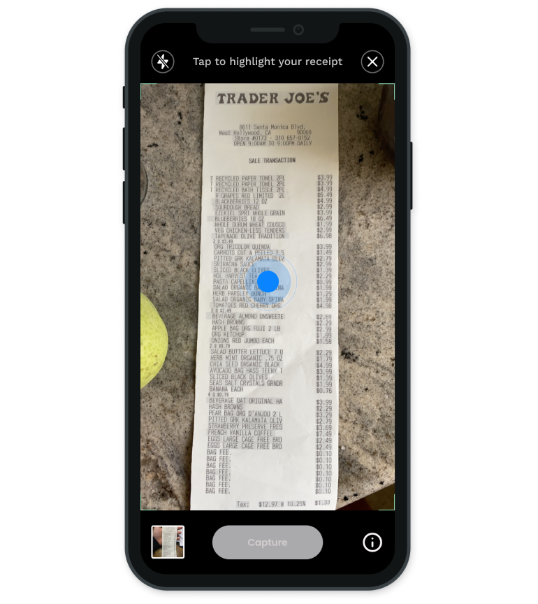
Another concern was how well will a user recognize what to do here. Using the scanner to import their receipts is a crucial part to the of the app.
I purposely highlighted only part of the receipt in order to test to see if users would understand how to highlight the rest just incase the scanner wasn’t able to pick everything up the first time.
Would seeing this screen tell the user that there is more that needs to be done before moving on?
Would users quickly understand that they could use the pins to adjust what is highlighted?
Would participants see the “hints” on top and would they be enough to help them avoid any confusion or recover?
STEP 5
TEST
USABILITY TESTS
I tested 5 participants through a moderated Maze session where I observed via Zoom.
Overall, the tests went incredibly well!
5/5 users knew exactly what the app is for.
5/5 Users knew how to move cards over to the “wasted” and “grocery” sections.
5/5 users knew how to manipulate the highlight pins on the camera to finish off highlighting their receipt.
Participants had positive things to say about the interface and said they would love to have an app like this because they’re always wasting food!
However…
There was one major usability issue
STEP 6
ITERATE
Iteration
2/5 users struggled with using the blue tap icon to trigger the receipt being scanned. In their defense, the hint at the top of the screen only said to tap the screen, not the blue dot. During this part of usability testing, users were asking out loud if there was a help button or some sort of hint area, so they were not seeing the hint at the top of the screen.
Only 2 out of 5 participants had an issue with this but because it takes a fairly low amount of effort to fix and is incredibly crucial to the design, it needed to be fixed and tested again.

In testing, users were saying out loud, “what do I do? Is there like a help button somewhere?” The two users who struggles with pressing the blue button said that they didn’t see the hint on top and I had also asked the other 3 participants if they had used the hints on the top of the screen to help them get through the upload process. The answer was - “No, I didn’t even notice the hints up there” for the other three users.
I decided to to move the hint front and center right on top of what users needed to interact with in order to continue through the process so that the users would absolutely see it instead of having it on top.
Final Prototype
NEXT STEPS
The immediate next step would be to test this iteration again with users and measure to see if this improved or hindered usability in this section.
The next steps after this would be to build out the rest of the app section by section, testing with users and iterating throughout the entire process.
With this project I really had to focus on designing the minimal viable product because of the time constraints I had even though it was very hard not to build everything out and create a bunch of features that would support solving the problem of food waste at home. Creating task flows and making a feature roadmap that documented what needed to be developed for a testable prototype was critical for keeping inline with delivering an MVP.
Thanks for reading! ✌️