

THE PROBLEM
Users download the Citizen app to have a better sense of what’s happening around them and to feel safer in their immediate areas but once they’ve downloaded the app, users start feeling more anxious, less safe, and more paranoid after they see how much crime is happening in their cities.
My Roles: I worked as the solo UX/UI designer on this project
Project Time: Four weeks
Tools: Pen, paper, Miro, Figma, Maze
THE CHALLENGE
Designing a new feature that helps users feel less anxious about their safety and that integrates seamlessly into Citizen’s existing design system.
THE SOLUTION
A new feature for Citizen that allows users to create a flexible perimeter around their neighborhoods and communities.

WHAT IS CITIZEN?
Citizen is a safety surveillance app that alerts users of crime, accidents, weather, road closures, local news, natural disasters, missing persons as well as COVID-19 contact tracing and other sorts of dangerous events in a user’s area.
The app consists of reports that are either pulled from 911 calls or from users who live around your city that have been near a safety hazard and filmed it or reported it on the app itself. The app positions itself as a way for the community to watch out for one another using the power of the community as a shield against danger.
FROM THE COMPANY
“We live in a world where people can access information quickly, share effortlessly, and connect easily — but we have yet to see the power of bringing people together to watch out for each other. At Citizen, we’re developing cutting-edge technology so you can take care of the people and places you love.”


Any user can broadcast live video and commentary if they’re near an event and post it to the Citizen community
PROBLEM SPACE
Citizen itself Has been heavily criticized as being a fear-based app that gamifies paranoia amongst its users and creates a culture of fear even for those who live in safe neighborhoods. Mass reporting on crime can cause unwarranted fear of crime and apps like Citizen have the ability to disseminate that fear more quickly and frequently than TV news and the internet
This leaves Citizen with a problem: Using the Citizen app is causing users to become increasingly paranoid and anxious but the whole point of Citizen is to help their users feel safe and more aware

During user interviews - 100% of users mentioned that they downloaded the app to be more aware of their surroundings and feel safer about their environment. Additionally, 100% of users said they feel more anxious after downloading the app. Here are some common alerts users receive in Los Angeles.
Approach
I approach this problem using the design thinking methodology to guide me through the design process so that I can keep the focus on the people I am designing for and how I can create the best value for them
How I came up with the feature


Step 1:
Empathize
ESTABLISHING RESEARCH GOALS
Before diving into the process, a plan was developed in order to organize research goals, questions and detail the methodologies that would be used.
Understand more about surveillance apps on the market today
Understand how users feel about their safety
Learn what “safety” means to them
Understand why and how people use Citizen
SECONDARY RESEARCH
To get started learning more about Citizen, secondary research was conducted to get a better understanding of the app and its relationship with society.
Findings included app statistics, current features that the app is pushing as well as plenty of buzz and news articles describing the good and bad of having an app that allows users to view crime on a large scale.
Statistics from their website

10+ Billion
alerts sent so far

9+ Million
users

60
cities and counting
Citizen PROTECT
Citizen recently launched a $19.99 /month subscription to a “Protect Agent”. A subscriber can connect 24/7 with Protect agents through the Citizen app by text or video chat - or by shaking their phone or screaming. Protect agents can talk users through situations, call 911, guide a person to a cooling station during a heatwave, monitor someone on a first date or an evening still for peace of mind.

Digitizing an Age Old Problem
Citizen has been and continues to be heavily criticized as being a fear-based app that gamifies paranoia amongst its users and creates a culture of fear even for those who live in safe neighborhoods.
Paranoia about crime and racial gatekeeping in certain neighborhoods is not a new problem.
Mass reporting on crime can cause unwarranted fear of crime and apps like Citizen have the ability to disseminate that fear more quickly and frequently than TV news and the internet.
COMPETITIVE ANALYSIS
After learning more about the app, its position in the market, news and issues pertaining to it and a little more about how it operates, it was time to learn more about Citizen’s competitors.
In order to better understand competitors both direct and indirect, a competitive analysis helped me further analyze apps that are similar to Citizen in order to better understand the market and what apps are offering their communities.
1:1 USER INTERVIEWS
After some general research had been conducted about the space Citizen operates in as well as its competitors, it was time to talk to actual users and hear what they had to say.
Users were 26-35. I interviewed four women and two men.
A total of six participants were interviewed, all of which were very excited to talk about their experiences using Citizen. To my surprise, 5/6 users all had used Citizen to measure their level of safety during some type of situation that directly affected them.
Step 2:
DEFINE
MAKING SENSE OF THE DATA
After I finished up talking to users, I had a bunch of rich qualitative data I wanted to get synthesized.
I recorded the interviews on my phone (with their permission) and originally wrote down participant responses on paper during the interviews. Afterward, I sat down and transferred participant responses onto colored sticky notes by participant - looked for patterns and moved notes accordingly.
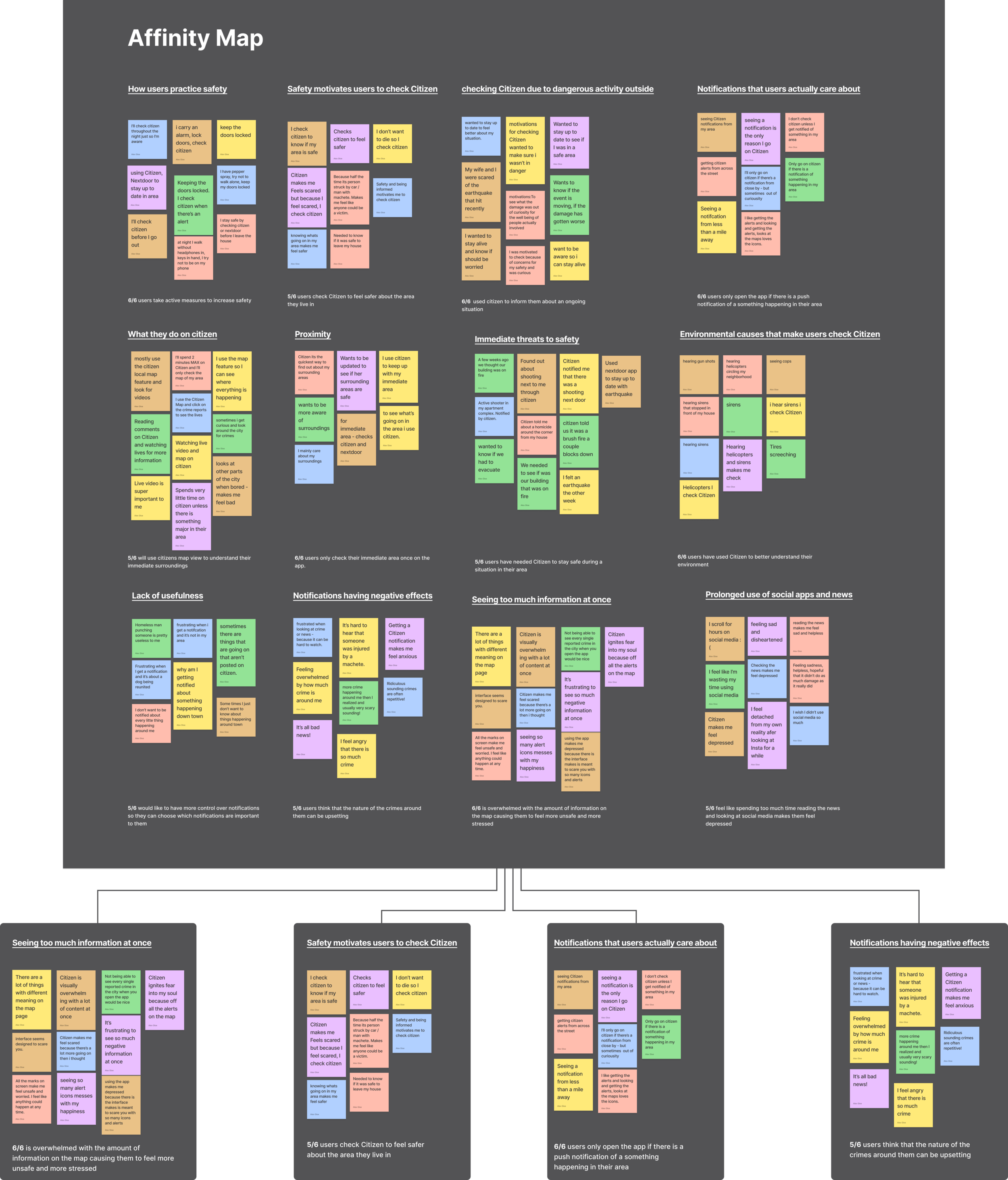
Only after the stickies were grouped were labels created to provide context for the groups along with a key insight I learned from each grouping. Here are some examples.
EMPATHY MAP
After initial groupings, I regrouped sticky notes into “doing, thinking & feelings, seeing, hearing, pains and gains in order to further understand my users and in pursuit of making a persona that would embody my user group.

USER PERSONA
By looking at similarities in data from my research, I was able to develop a user persona that represents the “archetype” user. This persona will be used throughout the entire design process to ensure that I’m designing for the users.

WHAT IS THE PROBLEM?
After going through Melissa's pains, wants, needs, and insights from the Persona along with prominent groupings and insights learned through the affinity map exercise - I developed a problem statement that I thought would provide the most value to users based on what I’d learned through research:
{Melissa} needs to {see relevant information from her immediate area} because {she wants to feel less anxious about her safety in her neighborhood}
HOW MIGHT WE SOLVE IT?
Following that, 3 HMW statements were made that would help me explore different perspectives for solving that problem.
HMW allow Melissa to choose what alerts are important to her?
HMW reduce Melissa’s level of anxiety while still alerting her of safety concerns in her area?
HMW let Melissa have more control over the area she sees on the map?
STEP 3:
IDEATE
RAPID IDEATION
In order to generate ideas quickly, I used the crazy 8s exercise to sketch out ideas for a possible solution on paper
Each HMW was on a sticky note and posted to my crazy 8s paper. I ideated on each statement for eight minutes each. After, I went back and left some notes. Due to the kind of space this app operates in, it would be tricky to implement some of my ideas in a realistic amount of time. Also, some ideas I had for solving this problem would go against Citizen’s main business goals.

CONSIDERING USERS AND BUSINESS
In the initial phase of ideation - There were multiple ideas that were considered before moving forward.
A toggle system was considered where users could disable or enable specific alerts so that they could have more control over what they were notified about.

However, because of the uniqueness and variety of the reports on Citizen and how crimes and alerts can quickly change into something else, developing on/off switches for all cases would be time-consuming, difficult and would go against the business goals of the App.
Additionally, having a user turn off alerts because they don’t want to deal with the notifications - might cause them to miss an alert when it really mattered.
Another idea was to create a pill filtering system where users could select whichever type of alert they would like to see on the map. That being said, there would be a lot of pills to select from and users would most likely spend more time than they would like sifting through all the pills looking for information that is useful to them.

KEEPING RESEARCH INSIGHTS IN MIND
During user interviews, users reported that they usually spent very little time on the app and that they would prefer not to spend any more.
Applying this insight to ideation, having to go through all the pills would be time-consuming, and having one pill enabled while the rest are disabled could mean a user would miss a potential alert that they should know about.
Users also reported that they spend more time on the app if there is something going on near them.

80% of users had been in a situation where they had used Citizen to help with information gathering during an event directly related to their immediate area.
There were others but I’ll just be giving two examples here. One that I heard during interviews was an electrical fire in one of the participant’s apartments and the other was an active shooter in another participant’s apartment complex.
Users were primarily looking at their immediate area to gauge their safety. Their goal was to be aware of their surroundings so they can feel safer in their neighborhood.
One last thing I uncovered from talking to users was that they felt, “even more scared” now that they had downloaded Citizen.
100% of users said that they felt more overwhelmed and anxious than they did before due to all the crime happening around them.

An example of what notifications, headlines, and screens users see. These contribute to the increased paranoia users have about safety. This was seen both in secondary research and user interviews.
PUTTING IT ALL TOGETHER
To add to my last point - I asked users to show me on their phones what they meant by “the crime happening around them”
They opened their phones and showed me their screens which automatically opens to the area around their current location. I asked them to show me the general area around their neighborhoods. They proceed to show me the area but after a quick glance, they started showing me all around Los Angeles, zooming in on traumatic alerts around the city. In very few cases were any “scary” events happening nearby their actual neighborhoods.
After this, I started feeling confident with deciding on a solution to the problem that users are facing.
I learned that what was really going on was that my users were all going through a form of virtual rubbernecking!
Users’ original intention for using the app was usually just to see what was happening around their neighborhoods and maybe the areas nearby if they got an alert.
But they’d often get distracted by other events happening around the city that were gruesome, ridiculous, or aggravating but posed no real threat to their safety.

A view of the interface to demonstrate what users were showing me
Battling the Perception of High Crime Rate
This was not the first time I had heard this.
There was a large amount of secondary research detailing how - the ability to have access and to explore an entire city’s worth of crime is making users incredibly paranoid of their own immediate surroundings and creating a culture of fear in every city where Citizen has been deployed.
This touches on a previous finding from this case study where I discussed “digitizing an age-old problem” where mass reporting on crime can cause unwarranted fear of crime and apps like Citizen have the ability to disseminate that fear more quickly and frequently than TV news and the internet.

Throughout this process, I couldn’t help tying in my previous education. The general public having access to crime at this scale reminded me of Cultivation theory, founded by George Gerbner in the 1960s which details the effects of media on culture. While the theory covers a lot of information regarding the effects of technology on humans, it’s only necessary to mention parts pertaining to this case study.
The theory argues that the media generally presents an image of the world that does not reflect reality. Television images are an exaggeration or fantasy of what actually exists. There is a disproportionate number of handsome gentlemen, beautiful women, crime, wealth and violence. As a result, people end up perceiving the real world in a distorted manner and viewing actuality through a ‘television perspective’.
Additionally, constant exposure to the media content cultivates specific values, beliefs, attitudes and desires in people. These newly preconceived notions shape their perception of the world and they ultimately influence how others perceive them. People, therefore, end up unconsciously shaping their thought processes and behavior based on what they consume.
Obviously, this can be applied largely to what we experience through social media and the 24/7 news cycle we have today. But now with apps like Citizen, that process is much quicker and reaches a lot more people.

HOW MIGHT WE?
How might we let Melissa have more control over the area she sees on the map?
If we could limit the amount of information users see, while still keeping them updated with safety alerts - it would help alleviate some of the anxiousness users are currently feeling while keeping them informed enough to be safe and aware.
The idea was to create a feature where users could use their fingers to draw a boundary around their neighborhood so that they would be shielded from the rest of the cities notifications and only be alerted when something occurs within that boundary.

Citizen could still send safety alerts of any kind so long as they were within the users set perimeter. Having this set perimeter would also allow users to “mute” whatever else was happening in the city since 99% of those crimes and events aren’t relevant to them anyway.

USING THE FEATURE IN CONTEXT
I wanted to show the context and environment my persona would be operating the feature in as well as show how it could help solve the problem.
I created a storyboard to help illustrate this:

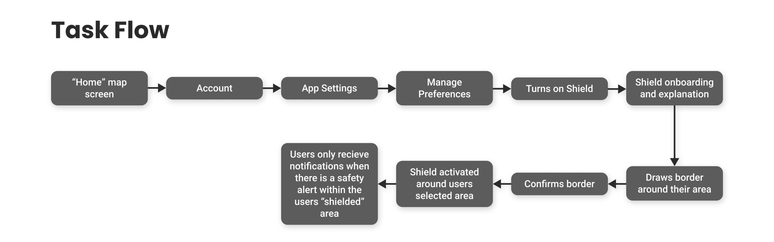
TASK FLOW
I created a task flow of a user turning on the "Shield" feature for the first time.
Method 1 (task 1): Turning on the shield feature through the settings screen.
Method 2 (task 2): Turning on the shield feature by pressing the Shield icon on the home screen.

SITE MAP
I recreated the sitemap for Citizen in order to show where the new feature would live within the existing architecture of the app.
Within Citizen’s notifications page or within the profile page, users can find the app’s notification settings. Once inside, users have the choice to turn on or off helicopter notifications, COVID-19 notifications, and weather notifications. It made the most sense to put “shield’s” on/off setting here.
I believed the Shield Mode switch should live within this page since that’s where the other notification toggles are that let the user control their notifications.
Because of the project type and relative simplicity of the task flows, I decided to forgo a card sort and instead would see if my choice was validated later during usability testing.

FEATURE ROADMAP
Now that the flow had been mapped out for the new feature, I could create a feature roadmap detailing what elements I’d need to design in order to test those flows with the prototype.
Along with the “must-haves” for an MVP, I included another feature that could possibly be explored later that could potentially help users identify areas in and around their neighborhoods that see frequent criminal or dangerous activity.

Now that I had properly ideated on a solution, it was time to start designing!
STEP 4:
PROTOTYPE
PAPER WIREFRAMES
Before touching the computer, I wanted to draw out how the interface should look. I’ll always start with pen and paper because it helps me work quickly and allows me to experiment with different layouts. For this project, I’m adding a feature to an existing system so the focus here was not so much the figuring out how to lay out a bunch of screens but more so how to demonstrate how the new feature would reuse and utilize existing elements.
While thinking about how to lay out the wireframes, my goal was to make it as simple as possible. I figured that the fewer “new” elements and components to the design, the better. I didn’t want users to experience any disconnect between Citizen’s existing system and the new feature.

(From left to right)
Sketch 1: I showed what Shield’s on/off switch would look like in the existing notifications settings screen.
Sketch 2: Demonstrates what using the index finger to draw a border around your location would like.
Sketch 3: A sketch of what the Shield screen would like when activated. On the middle right of this screen, shield is represented as an icon and matches the existing icons above (messaging and a zoom out/zoom in function).
INTERFACE EXPLANATIONS
After laying out the design on paper, I started designing in Figma. The challenge here was to seamlessly integrate elements cohesively with the existing interface.
To explain design decisions and provide more clarity to my additions, I’ve included some annotations below:

PROTOTYPING
Time to test!
In preparation for usability testing, I created a prototype to test functionality and to see if the feature runs into any usability issues while participants work through tasks I’ve set for them.
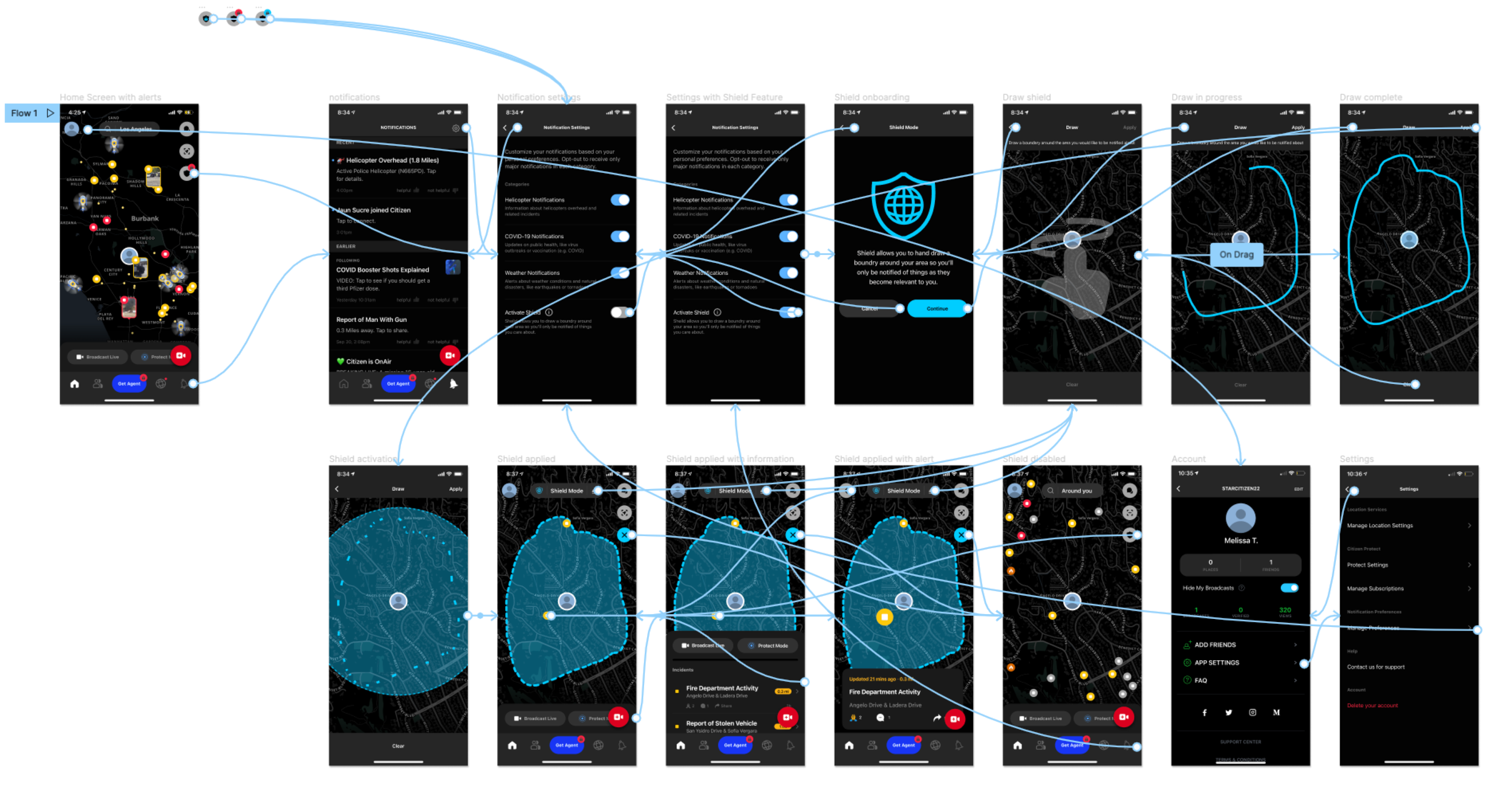
Prototype
STEP 5:
TEST
USABILITY TESTS
I conducted 5 moderated usability tests where participants shared their screens with me through zoom while they completed the tasks I had set for them through Maze. I asked them to please think out loud while they went through the prototype
After the tests, I transferred my notes to stickies and made an affinity map in order to organize my findings and to prioritize any revisions.
Specific testing goals were to see if the location I chose to put the on/off switch for Shield was valid, how users navigated to the on/off switch, if participants knew how to edit their shield once it was completed and to see if users were easily able to identify how to activate and deactivate their shield once they had completed the shield onboarding.

Findings:
5/5 users completed all tasks quickly and easily
3/5 users, when asked to edit their drawings after shield had been applied, used the edit symbol on top of the page.
2/5 users tried to touch and hold the blue border to edit their drawings.
3/5 users reached the notifications page through the profile icon which was unexpected
1/5 users used the notifications tab to navigate to settings when asked to turn “Shield” on.
1/5 users tapped the shield icon to attempt to turn on Shield but admitted that they didn’t think that the shield icon was actionable because of the lock placed on it.
Afterward, the 4/5 users that either used the account button or notifications tab to navigate to find how to turn Shield on, were asked why they didn’t use the shield icon on the homepage - 4/5 users said they didn’t notice it was there.
3/5 users knew how to edit their shield once they had already activated it.
2/5 users attempted to edit by tapping or holding their finger down on the blue border.
STEP 6:
ITERATE
PRIORITY REVISIONS
The amount of iterations for this project was minimal. I would have loved the opportunity to conduct more testing with more participants in order to further validate my work. For now, with the data from testing, I made an affinity map to help me better understand learnings from usability testing.
Based on my research having the shield icon on the homepage with a lock on it is unnecessary. In a new version, the shield icon would only appear on the home screen once the feature has been turned on in the settings.
I would also revise the editing option so that users could also edit by holding down on their shield. I’d love the chance to test this with more users to see if this solution would be useful and intuitive with a larger participant group.
WHAT I LEARNED
Throughout the course of my research, especially in the beginning stages, it was clear that there was plenty of need for a redesign of the interface. From the app’s navigation and architecture, the colors used, to misinformation and a somewhat unmoderated comments section, I believe Citizen could really help reduce this culture of fear that is being generated from their app by redesigning aspects of their product.
Additionally, when I was getting familiar with the Citizen app interface, it was challenging at first. There are a lot of design standards that the interface doesn’t meet and it caused a lot of confusion with navigation through the app.
Initial findings from discovery research were only strengthened during user interviews about how the app makes people more paranoid for various reasons and this felt super validating.
Citizen is very much a useful app to have. You’ll be more informed on what’s happening around you but it’s not free information, you run the chance of becoming more paranoid once you start using it and I often heard participants and friends say that they’d be better off “just not knowing” what’s happening around them, even though that’s why they downloaded the app in the first place.
This is a problem I tried to solve by designing this new feature and I’d love to continue testing my proposed solution with more users and hopefully reduce anxiety and make people feel more safe in their neighborhoods.
Measuring Success
How would I know if my new feature was performing “successfully”?
This would depend on multiple quantitative and qualitative findings and it would have to be observed over time. Success would definitely be measured based on users emotional state while using Citizen and if the Shield feature had made any difference for them. Do they feel less anxious? What kind of alerts are they checking? Are they still viewing a cities worth of crime or just their immediate area?
Feature usage would also be a good measurement of success but it couldn’t just be that, it would have to be prolonged usage and I would want to know if having the feature activated decreases users time on the app.
Public perception? This is more of a long-term determination of success. At the moment it seems like Citizen’s image is somewhat negative. The app was originally named Vigilante which inspired average people to actively look for crime and report on it through the app. Still, there are plenty of psychological papers and news articles about how the app uses fear as a way to gain more users. If this feature were to be implemented, users could truly take their safety into their own hands and it could possibly demonstrate to the user base that Citizen has their best interest in mind and actually wants to help protect their users.
Thank you for reading ✌️